Shopify storefront design

I worked with a colleague to build the company’s Shopify storefront. I managed the theme code and website design while my colleague managed photography and new product listings.
Designing the storefront
I saw that Liquid displays HTML elements with logic written in Ruby. I was able to take full control of finer details with existing CSS stylesheets.
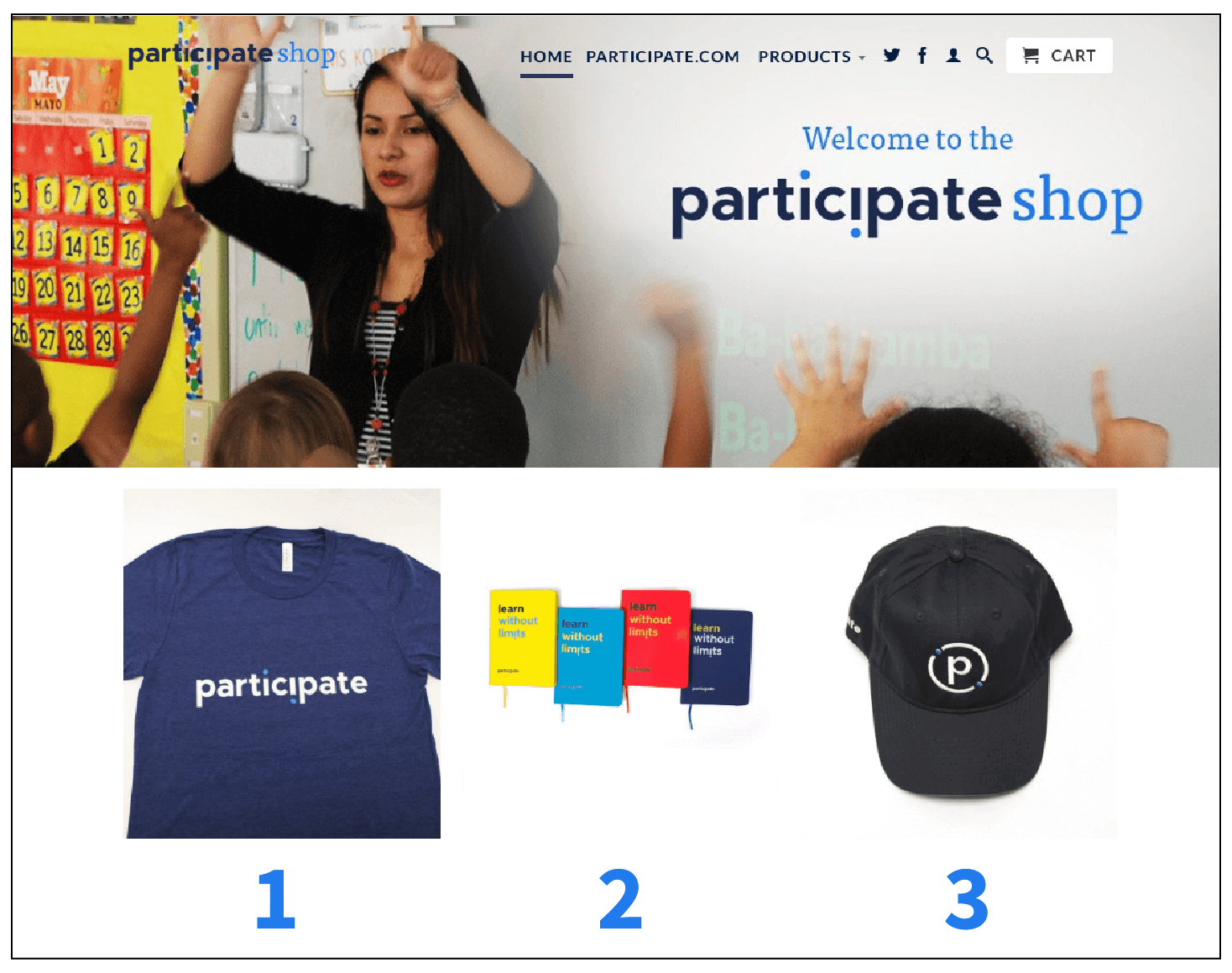
I envisioned a home page that featured all available products in a responsive grid. Shopify’s pre-built theme only allowed us to add three featured items, so I adjusted the theme template code to add more.


An intermediate photo choice worked well, but it didn't mesh with the default menu.
I set up a copy of our theme for QA testing and found the sections of code I needed to change. Once I understood how the theme was built, I used existing pieces of code to structure a new home page design.
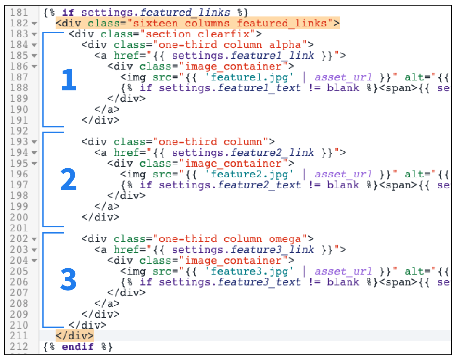
Within a Liquid template, I could add as many new product object copies as we needed
The properties inside Liquid tags needed to be updated each time a new featured item was created so that the pages and images linked together correctly. I added these new key:value pairs in a JSON file so they would render on screen.
Documentation
After several instances of updating the code on my own, I wrote documentation on the process for my colleague so that he could take ownership of the storefront and free up my time to address other issues.
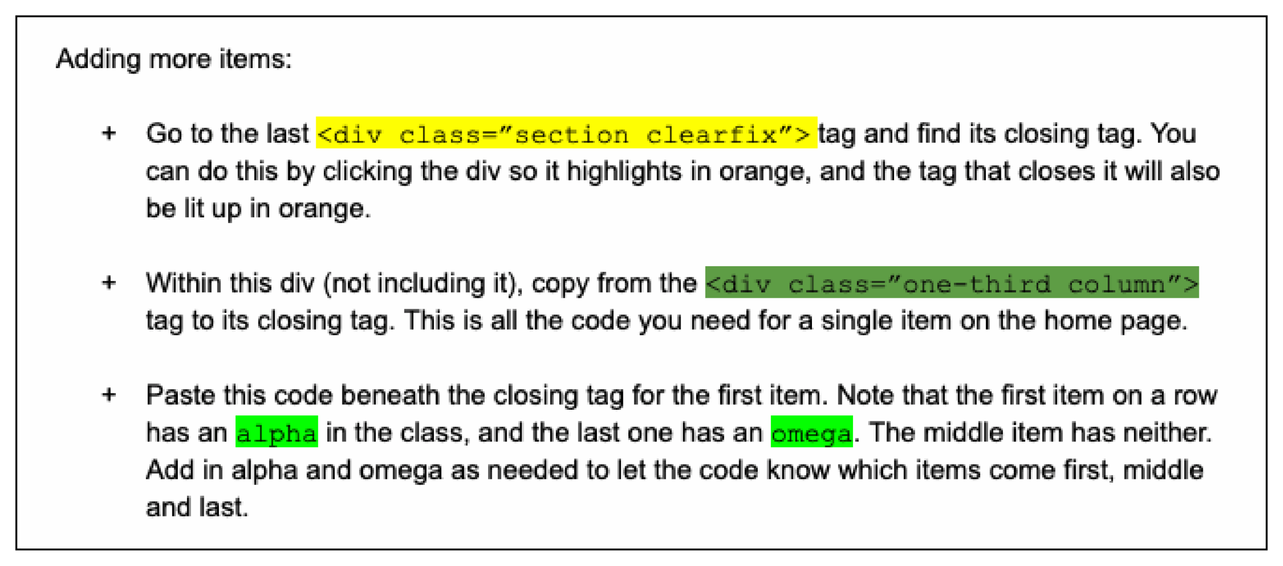
Snapshot of color-coded documentation written for my colleague
Results
Overall, our design upgrades resulted in a cleaner user experience and an easy reference for all products the company had on sale.